
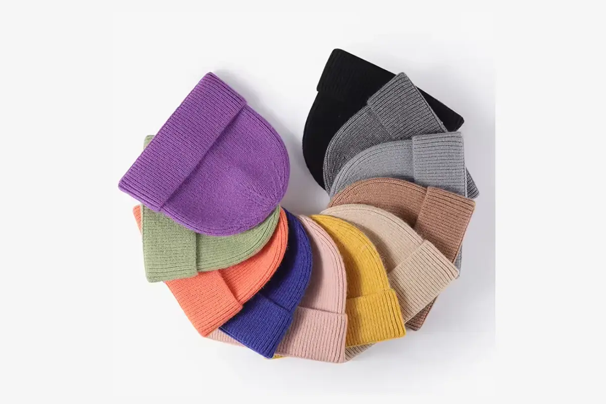
Screens, image processing, lighting and the material surface all affect the color you see. Use the image to start the conversation, then agree on a physical reference, viewing conditions and an approved sample to keep with the order.
Send the complete color reference
A color-system number needs its full code and system or material reference. Without that context, the supplier may work toward a different target.
Pantone explains that appearance changes with the material on which a color is produced. A paper reference and a textile reference aren't interchangeable without review.
If a physical swatch or an existing product is your target, offer it and mark the part to be matched. WiseBeanie's customization process includes reviewing these references by project. Send the code or physical-reference details and identify the components that need matching before the sample is made.
Name the master reference when several colors disagree
A project may contain a logo file, a physical swatch and a photograph of an earlier hat. If they don't appear to match, tell the factory which reference controls each component. “Match the brand color” is incomplete when those references differ.
Record the reference identifier and whether it controls the body yarn, thread, patch or printed packaging. Identify any components intended to contrast rather than match.
If a physical reference is unavailable, identify the approval route before treating a screen-based choice as final. You may use an image to narrow options, then request the proposed material for physical review. Keep those two decisions separate in the record.
Make a color correction specific
If a sample is unacceptable, compare it with the agreed reference in the same setup and describe the difference you observe. A comment such as “wrong blue” doesn't reveal whether you mean lighter, darker or a different hue. Include a photo for context, but it may not reproduce the difference accurately.
Ask the supplier to explain the proposed next step: a different available color, another material proposal or another sample. Don't assume every reference can be matched in every material or that correcting the body color will also correct embroidery and packaging.
When a new sample arrives, compare it with the master reference, not only with the rejected sample. Otherwise an improvement over the previous attempt can be mistaken for acceptance of the actual target.
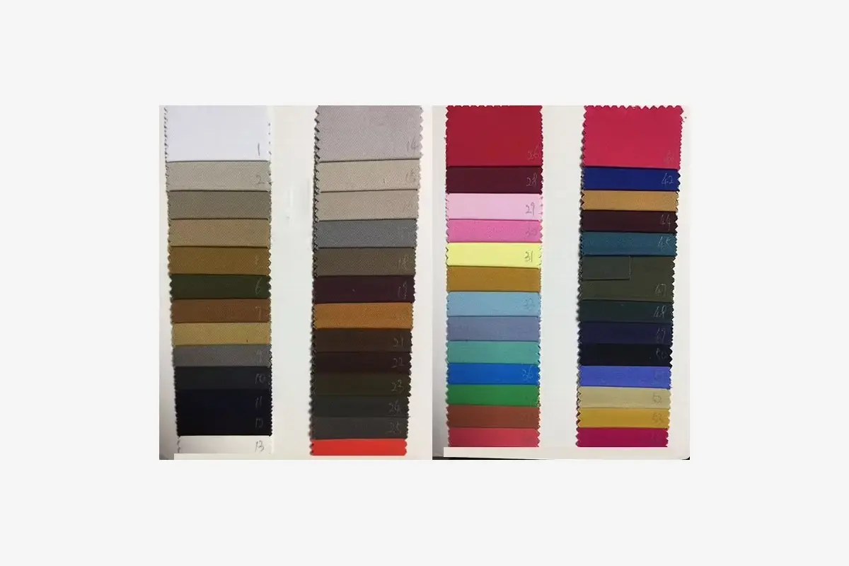
Protect the approved reference through the order
Identify the physical approval by style, component and date. If several people hold reference samples, identify each one and agree which will control production checks.
Keep references suitable for comparison and record any damage or change that makes them questionable. A worn retail return or an altered photograph should not silently replace the original approval.
For a repeat order, tell the factory whether new goods will be sold alongside earlier stock. Compare the new material with the approved reference under the same lighting and record any difference that needs review.
Compare side by side, in agreed light
Put the proposed yarn or hat beside the reference under the same light source and viewing arrangement. Comparing one in daylight and another under a different indoor lamp makes the comparison less reliable.
If appearance under several lighting conditions matters in your sales setting, agree on that review in advance and record the conditions. Photos taken under changing light won't give you the same comparison.
Camera exposure and white balance can shift an image, as can later processing. A supplier's photo is useful for showing progress, but it shouldn't silently replace physical color approval where that was agreed. State what you are approving in the reply.
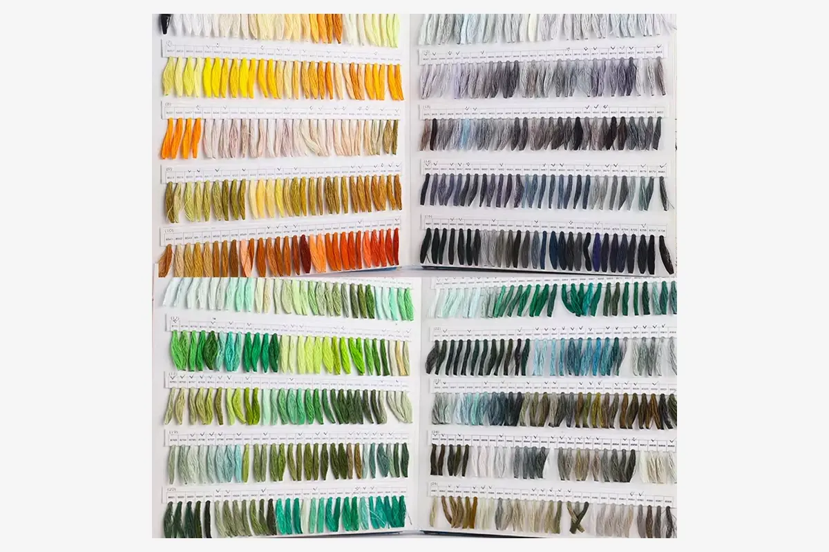
The body yarn isn't the only reference to consider. Embroidery thread needs to be viewed on the chosen knit; a pom may have its own material and color distribution. Patches and labels need a surface-color and contrast check, while printed packaging needs review on the actual substrate.
Calling all of them the same color doesn't guarantee they'll look identical. Decide whether you want a close match or a deliberate contrast, then view the complete sample.
Ask how production color will be checked against the retained approval. Include that check method and each component's reference in the order record.
Related Guides and Factory Options
- How to Approve a Custom Beanie Sample
- Review custom production options
- How Sampling and Production Work
Send complete color codes or physical swatches and identify which components they apply to. We will confirm the matching approach before sampling.
Discuss Beanie Colors